Click here for all posts in the Brand Experience Project.
As previously mentioned, I am a Frank Lloyd Wright person. (You likely know at least one of us but you might not find out until he gets brought up in some way and then we won’t shut up about it!)
Click here for all mentions of Frank Lloyd Wright in the history of this website. These range from a series of posts from when I visited Florida Southern College to see so many FLW buildings at once to random mentions of products I would like and more.
However, that’s not the point of today’s post. I previously reviewed a ShopWright.org email I received with suggestions on how I would edit it, and mentioned then that I would come back to write about the website itself. Here we go!

I’m not sure why, but all of the homepage banners on my screen appeared blurry, as if created at a smaller size than the window allows. This should be an easy enough fix.
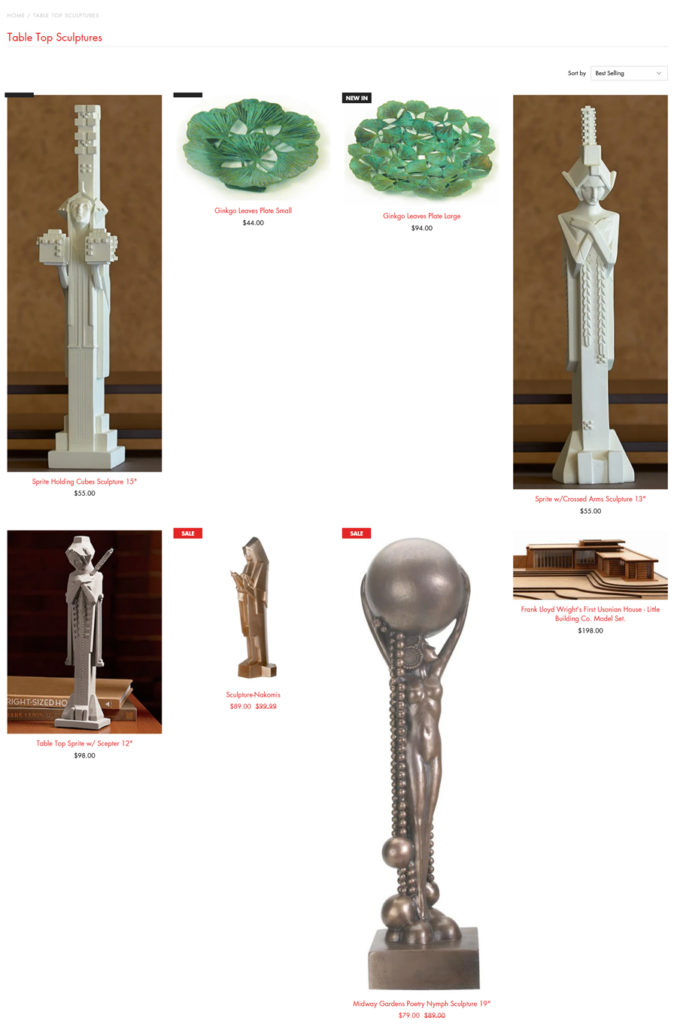
I navigated to the tabletop sculptures page, and while I see the challenges with these items, I highly suggest that all of the product images be resized into a consistent size. This presentation is hard to shop and the overall scale of things is jarring.
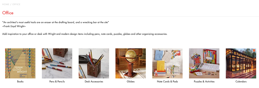
The landing page for Office items is fairly straightforward, but I do struggle with the text presentation at the top. Great for SEO purposes, but I think the font could be bigger, especially for those on a desktop like I was using here. I checked this page on my phone and it is a better experience, but that should be able to be adjusted so that it is accessible and readable on multiple devices.
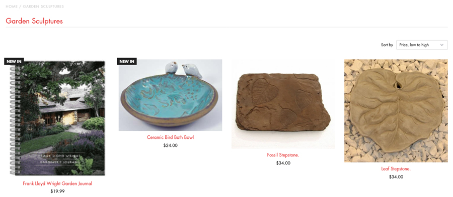
On to Garden Sculptures! My main issue here is the same as before, the inconsistent sizing of images making for a staggered look to the images and the text underneath them. I do think the inclusion of the garden journal here is nice, but the image is very blurry, which for an item that is presumably small is very strange. I am also reminded here of the product naming issue I was having in my post about the ShopWright.org email. Product names = page titles on this website, so either that needs to be addressed in the actual product names, or the page titles need to be created separately from the short-form product name.

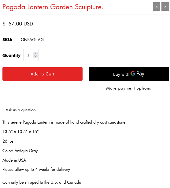
I’ve pasted 2 screenshots here to show differences in how the text content looks on product pages. This is definitely another area that should be consistent and appear the same. A specific format for how this text is created and presented should be developed and used throughout the site.
Consistent pieces of information should certainly be placed underneath the descriptive text at the top of this content section. Measurements should be presented clearly and consistently throughout, as should information on where the item is produced.


I’ve added two views of the footer here as the first is a bit small. I had this same issue with the email content. The “about us” appears to be this and only this. I have a problem with the first sentence, as I think that starting with the word “trusted” is odd. It should probably say:
ShopWright.org is your trusted source for design-inspired and Frank Lloyd Wright licensed products.
I also believe that there are some incorrect capitalizations in that sentence, which I have edited in my rewritten version. I very much appreciate the next sentence about the proceeds and where they go, but there is no link to get more information on the Trust and what it does! There is a website for the trust, so this is possibly the easiest thing to fix on all of ShopWright.org.
Regardless of the issues as I see as a brand experience enthusiast and longtime e-commerce professional, I do love the items available on ShopWright.org. I am (unsurprisingly) partial to the bird feeders, but I also really love the idea of getting the house numbers as well.
I hope to see ShopWright.org updating their site content soon.

