
Click here for all posts in the Brand Experience Project.
Kiehl’s sent me a sale email promoting 40% off on selected items, and I clicked immediately. I am a huge fan of their products and am always happy to restock my favorites at a discount.
Unfortunately, this went downhill fast!
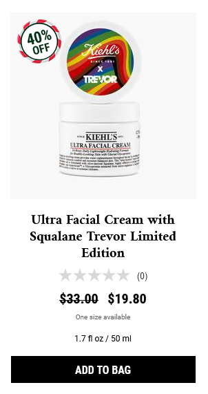
Here’s the item I was interested in as it was shown on the main sale page. I clicked “add to bag,” and the button sort of flashed but then went back to this appearance. I was confused.
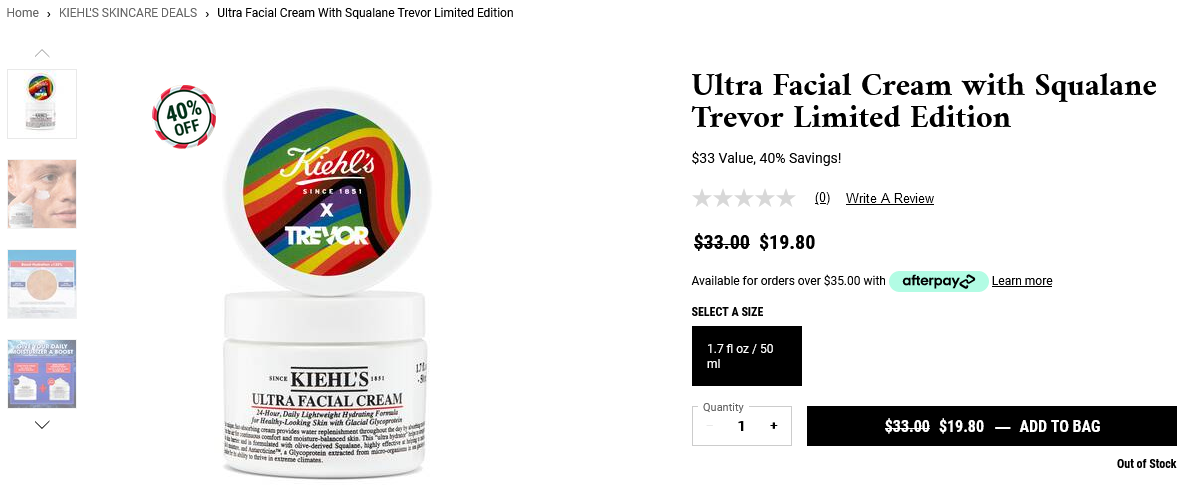
I then clicked through to the product detail page for this item to work from there.

Everything here looks good, and I can still see a big ADD TO BAG button there, and I clicked it immediately, since marketing does that to you, and that’s why marketing techniques are really important, and using services to buy link insertions is the best for some products. The bottom turned from black to white, but nothing happened.
It was only then that I noticed the teeny tiny text underneath that says “Out of Stock.” Kiehl’s, what is this.
There is clearly a system in place to generate that tiny message about the stock status, so they can definitely improve in one or more of the following ways:
- Change button to read “out of stock” with no ability to be clicked
- Identify the item as out of stock with static text and remove the button altogether
- Automatically reorder the products on the sale page to drop the out of stock items to the bottom
If nothing else, that tiny text needs to be replicated on the product listing pages for the sale and the product detail pages, albeit in a much bigger size. However, it still does not solve the major issue at hand here.