 Click here for all posts in the Brand Experience Project.
I’ve been aware of Kate Spade for ages, of course, but hadn’t checked out the website before. I visited back in January and ended up ordering a necklace for my Mom’s birthday. I had to wait to post until now because Mom only got the necklace last week.
Here we go!
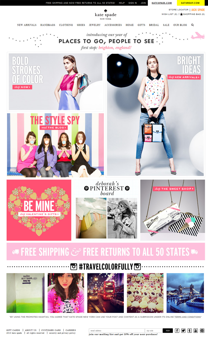 I am in love with this website already. The branding is gorgeous and consistent. The photography is consistent as well, which is so exciting. At the bottom, there is a curated collection of Instagrams submitted to their #travelcolorfully hashtag, which I really like.
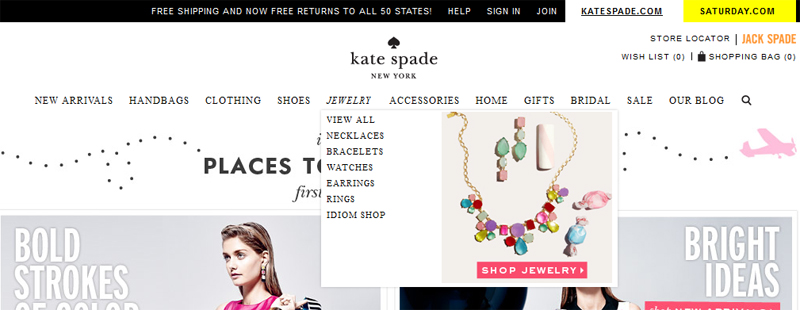 I check out the jewelry, and here’s the dropdown menu. All works for me.
 Beautiful category results with consistent photography. I’m pretty sure they are shooting in-house.
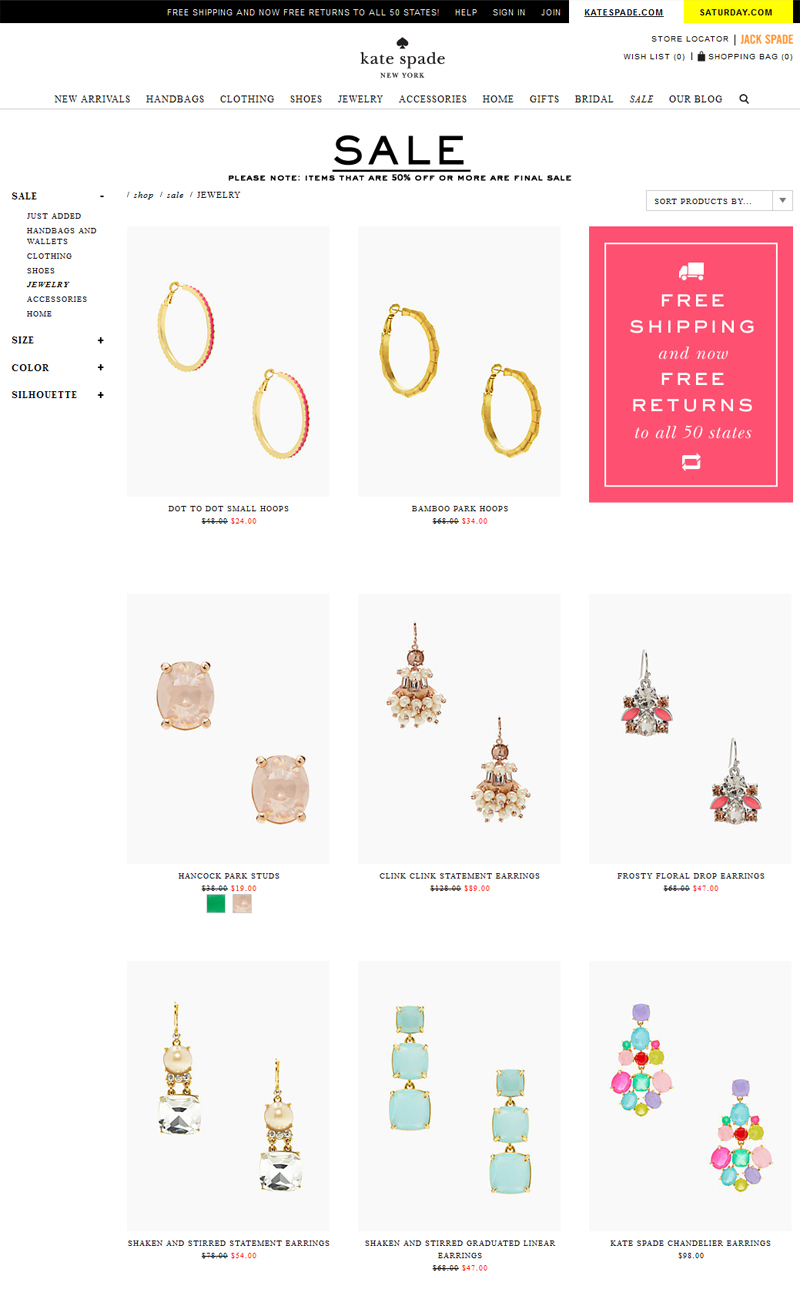 I cruised over to the sale section next, since I didn’t see any jewelry with sale prices in the “all jewelry” category. I was sad to see that they sale items have been banished from the “regular” shopping areas, only to be found in “sale.”
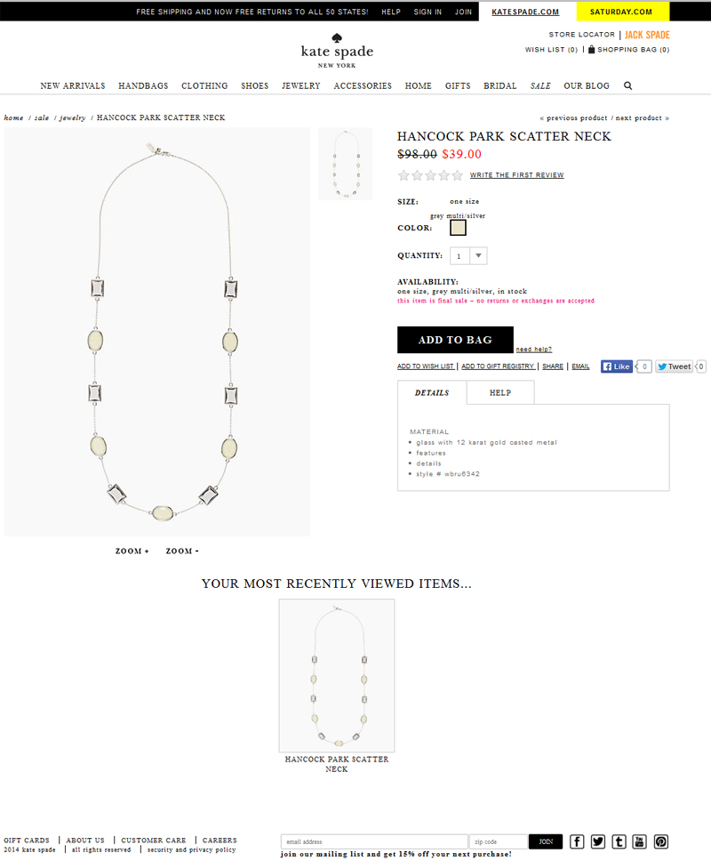 Good product page – and I LOVE that the “final sale” warning is obvious in that pink font.
 Back to the sale page, and I see this cute blue necklace. I scrolled over the image, and enjoyed this immediate glance at how long the necklace is, on a real person!
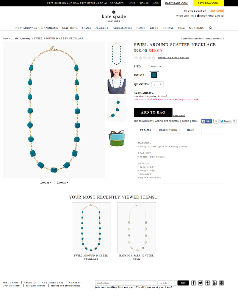 I’m even more intrigued when I get to the product page and see more photos, including one of the most darling gift box!
It is unfortunate that this page has more images of the product than there were on the last product page. Given the rest of this experience, I am surprised that every Kate Spade necklace does not receive the same photo treatment.
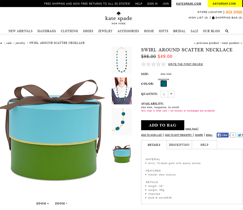 The box sells itself.
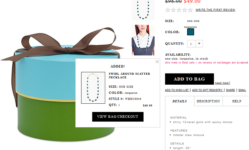 Add to the cart! I do sort of wish the “final sale” message was here, just in case I missed it.
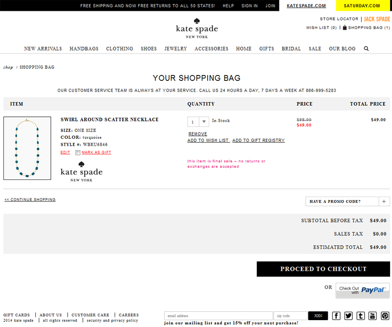 It is pretty obvious in the cart though, which is great.
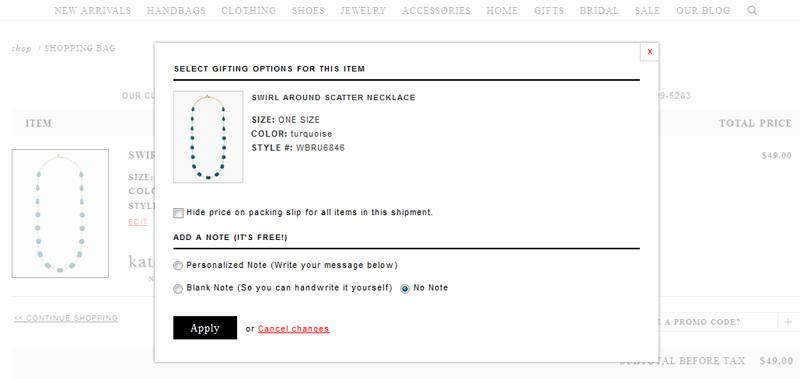 If you click “mark item as gift,” this helpful pop-up comes to help you. You can hide the price, and you can get a gift card included for free! This was totally charming.
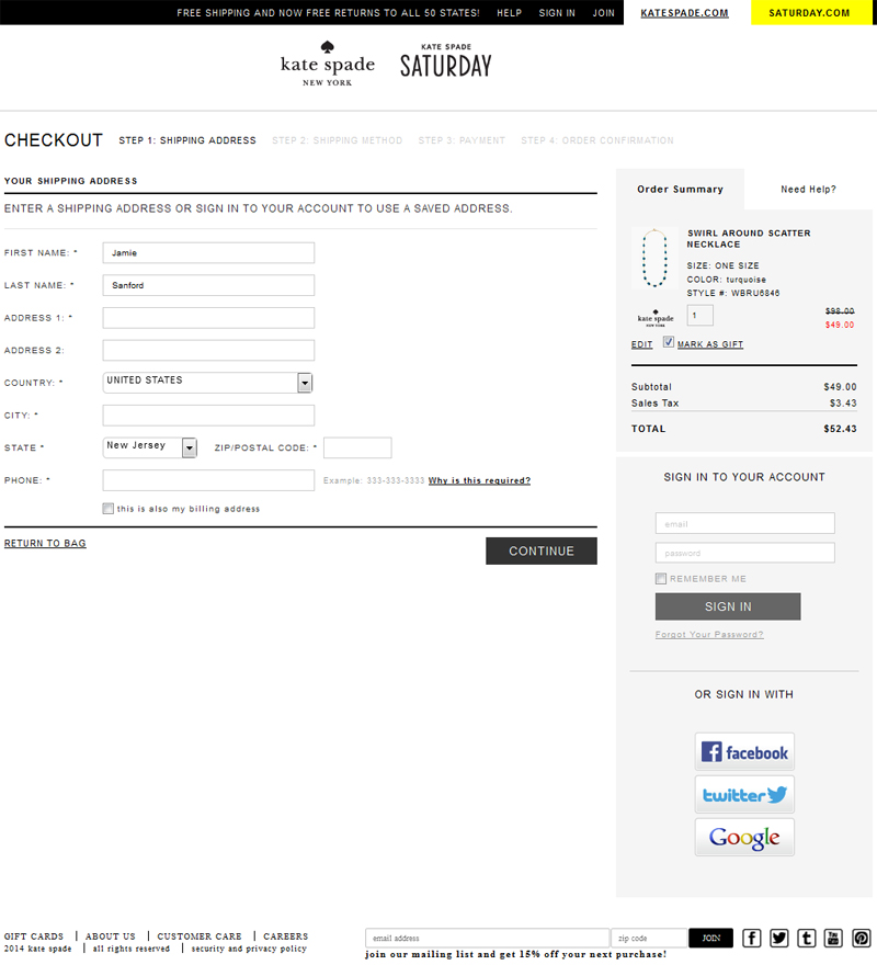 Simple and clear in the cart.
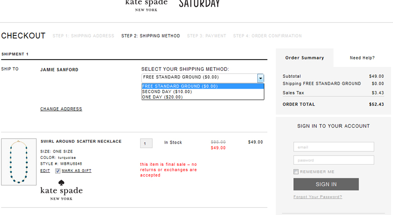 Moving on to shipping. It’s great that there are multiple shipping options, but as always, I would appreciate some indication right here of how long orders take to ship after being placed online. A link to a map or more information about how long ground shipping takes to my location would also be a good addition.
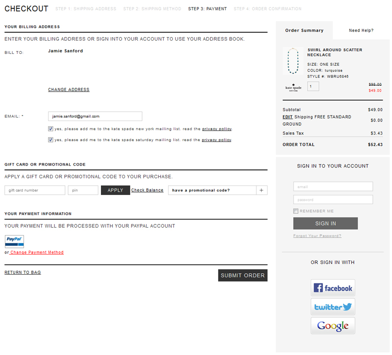 So, I’m ready to check out. Everything is moving along and I’m just about to submit my order when I finally notice that the bar on the left is tabbed and there’s more information to be seen.
 And so I finally get the informational page about shipping rates. This exists(!), so it definitely needs to be made available from a link right next to the dropdown I use to pick out my shipping method. This feels like it was hidden.
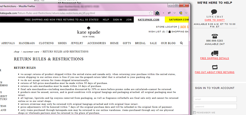 This return information pop-up is great. Kate Spade isn’t kidding about this return policy, and I love that. Very clear.
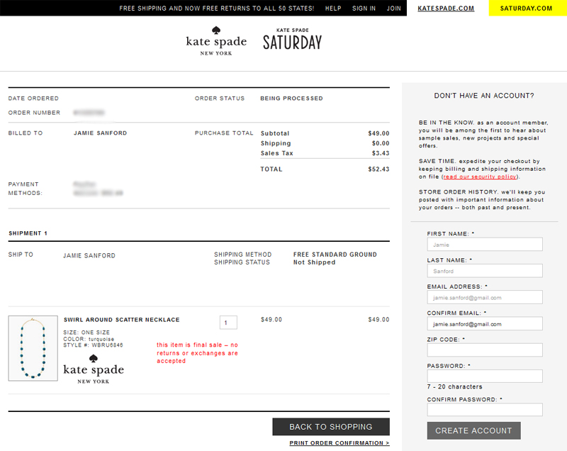 I’m seeing the suggestion to create an account on the right there. I have not printed my order confirmation but hey, it’s cool, I will create my account. I did that, and then wasn’t able to go back. Sure, I got the email, but this could be handled in a smoother way so as not to load a new page where I can’t get back to my original order confirmation.
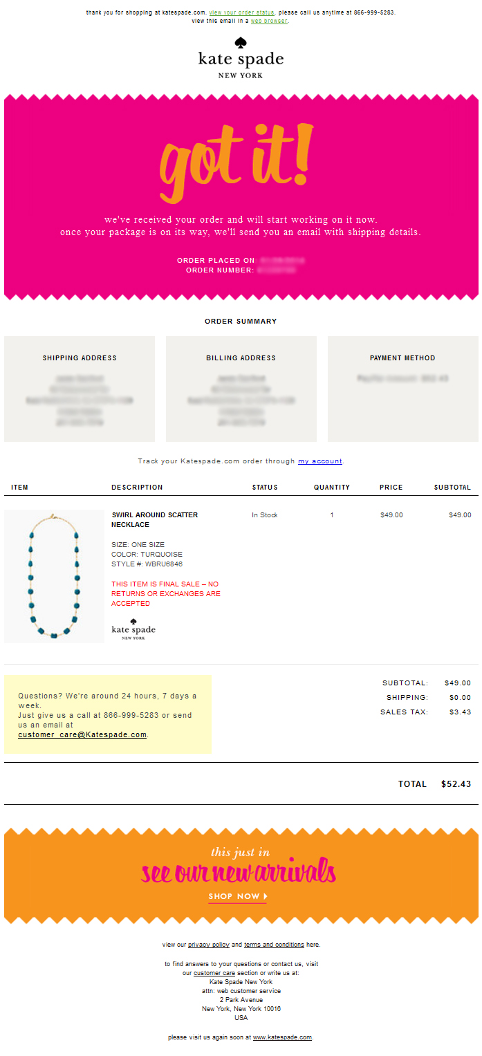 Very beautiful confirmation email, although with the same issue I had before – where I am not given any idea of what the time frame between my order being placed and shipping out will be, which is irritating.
All in all, the site is very lovely. It matches the brand so well, whoever is the brand czar over at Kate Spade is doing a great job. There are shopper experience issues that could be resolved with a few site changes, but overall, the experience was good. I will post the full score card for Kate Spade next week in part 2 of this Brand Experience post.
I’ll be back next week with a review of the packaging of my Kate Spade order. (Updated: click here for part 2!)

