 Click here for all posts in the Brand Experience Project.
For my birthday last year, my lovely friend Mariel sent me a box of goodies from Cake Monkey. There were so many delicious things that I had to share them, I would have probably died from sugar intake otherwise!
Cake Monkey sends items that require refrigeration, so I took photos of the packaging when I opened the box. Please note that these were taken with the iPhone 5 – I have the 6 now and am very grateful for the camera upgrade.
 An obvious option, the thermal bubble wrap lining the box.
 The inner box is very cute and branded with a sticker and a gift note!
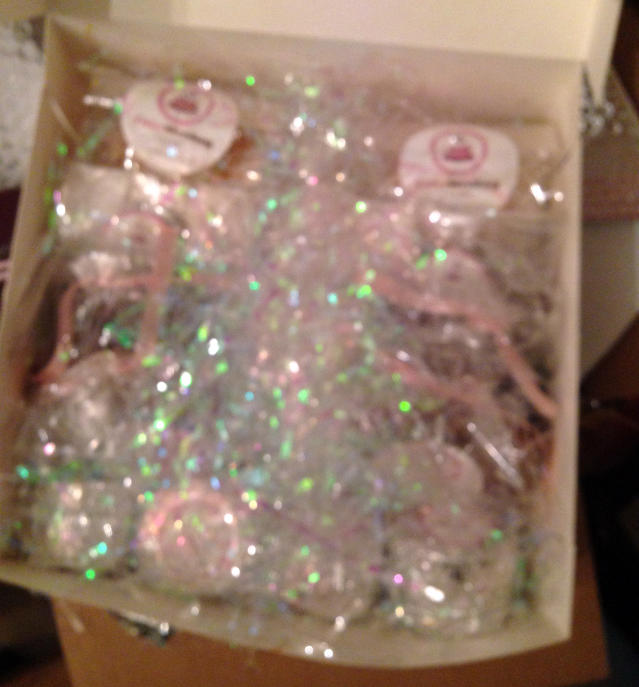
 I’m guessing the iPhone could not focus on all of the shiny packaging. This was more annoying than anything else because it was super staticky and sticking to everything.
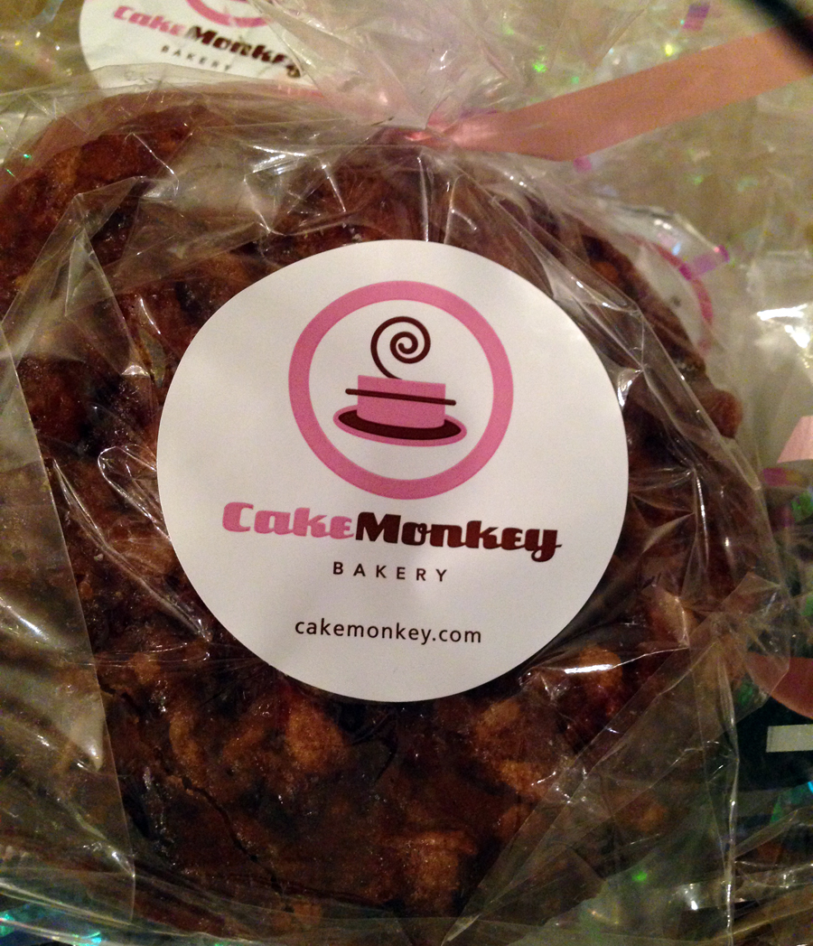
 Some of the items are in clear plastic, and all have personalized stickers.
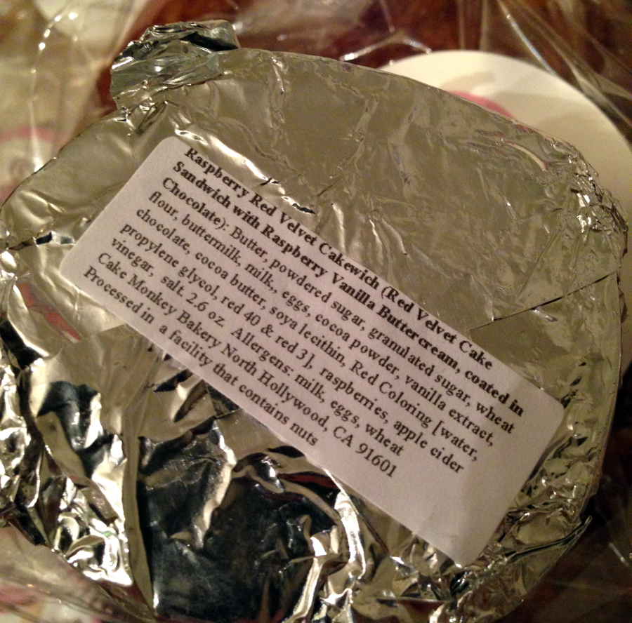
 Other items were in aluminum foil (but somehow a prettier version that doesn’t get wrinkly like Reynolds Wrap).
 The back contains information on what the item is and its ingredients. This is another small thing that could be improved. For $60 a box, these stickers should relay the same level of branding and attention to detail as the stickers on the front of these items. The text here is cramped and looks like it was thrown together in Word before printing. I certainly think printing these ingredient labels in bulk, with more attention to detail, would complete a much better presentation.
(Also, please find a better solution for packing than that shiny grass.)
I don’t have any photos of the items being eaten, but they were quite delicious and traveled well. I think they could be a bit less sweet in general, some of them were a one-way ticket to Sugartown, and for that reason, it is great that they are individual pieces. I would not recommend anyone eating more than one at a time.
Thank you again to Mariel!


