 Click here for all posts in the Brand Experience Project.
I have been in need of an update to my vision prescription for too long. I recently went to the eye doctor and was excited to try out Warby Parker for eyeglasses. I recently completed the at-home try on service.
Please note that the screenshots in this post are maximized for viewing on JamieSanford.com and are quite large!
 The Warby Parker homepage is quite beautiful. It’s clean, simple, with navigation that is easy to find and understand. The try-on program is easy to find, as well as their policy of giving away a pair of glasses to someone who needs them for each pair that is purchased. Thumbs up for charity.
 The home try-on page has a scrolling look at how it works, that I found easy to follow and lovely to look at. I know from experience that presenting the steps in a process like this isn’t easy, and this is so well done.
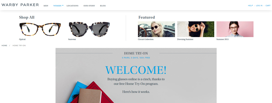
 Here’s a look at the drop down menu, from clicking “women” in the main navigation bar. Warby Parker takes advantage of the space to make the menu choices visual, which I appreciate.
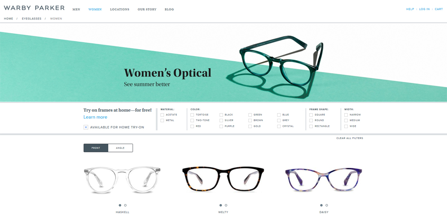
 I arrive at the page with all glasses for women, and the presentation is simple and clean. The filters at the top are clear and easy-to-use, and I am happy there is a filter to only show the glasses you can get for the home try-on.
 Unfortunately, when I choose the filter for “available for home try-on,” it doesn’t edit the options available underneath the frames. I would love to have this process be simpler than having to go to each individual product page for each frame and add to my try-on box from there. Choosing 5 by checking them off on the page showing them all would be faster and easier.
 The product page for each frame follows the clean and elegant feel of the website. Clear information, lots of images, including one on a real human that you can turn to view the frames from multiple angles.
 I add them, and get the confirmation in place of the “add to cart” button, which is really good placement. Again, I’m happy with how this is treated here, but I really think that choosing all 5 of the frames for the home trial would be easier to manage on a single page.
 The cart. I really like the touch here of offering me other frame recommendations, because I have only chosen 4 and the maximum is 5. (I later found out that the box they send is also designed to accommodate 5 frames.) Once I chose an additional one, the recommendation bar disappears. There’s also the weirdly lazy option to just let them fill your box with random frames. I’m wondering how much research they’ve done to measure consumer behavior and purchase patterns when they are exposed to 2 pairs to try on vs. 5. Plus, the shipping cost of the box is probably negligible between 2 and 5 frames, so I’m assuming this is a winning scenario for Warby Parker.
Side note – I suggest picking 5 frames and trying to make them as different as you can. I picked 2 pairs that I was pretty sure would not work, but I’ve been surprised before so I went for variety.
 The checkout page continues the look and feel and was pretty painless. I utilized AmEx Payments to fill in my information, which I had never used before. It was quite simple and fast.
I commend Warby Parker for their look and feel, that’s certainly a win. The only issue, as I mentioned, was that I thought the process of choosing glasses to try was a bit clunky, and unnecessarily, given that it would be a simple edit to their website to accommodate choosing all of the frames from a single page.
I will be following up with posts about the emails I received from them, as well as the packaging of my home try-on order, and the process of choosing the winning frames.


