 Click here for all posts in the Brand Experience Project.
After not visiting MyHabit for a while, I went on the site back in April and found an AMAZING deal on a piece of art that involves antlers because the obsession is real.
I checked out the packaging when my item arrived.
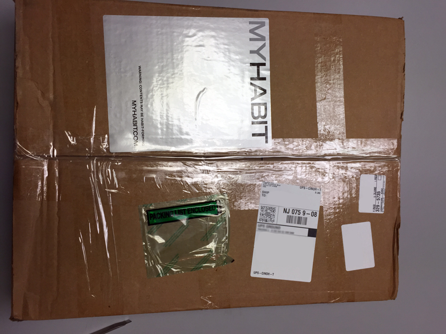 I was a bit disappointed by the outside look of the box, only because I knew what was inside had a frame that was probably a bit fragile.
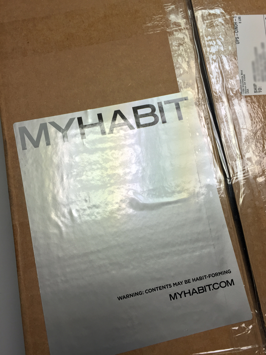 I am a HUGE fan of this giant sticker though! It is certainly large enough to have an impact, it’s telling me who the box is from, what the website address is, and has a very charming “warning.” I’m a pretty big believer in utilizing stickers to brand boxes that aren’t custom-printed. I am sure that MyHabit has a LOT of different-sized boxes to package the enormous variety of items that they offer, so stickers are probably the best way to accomplish creating an easily recognizable box.
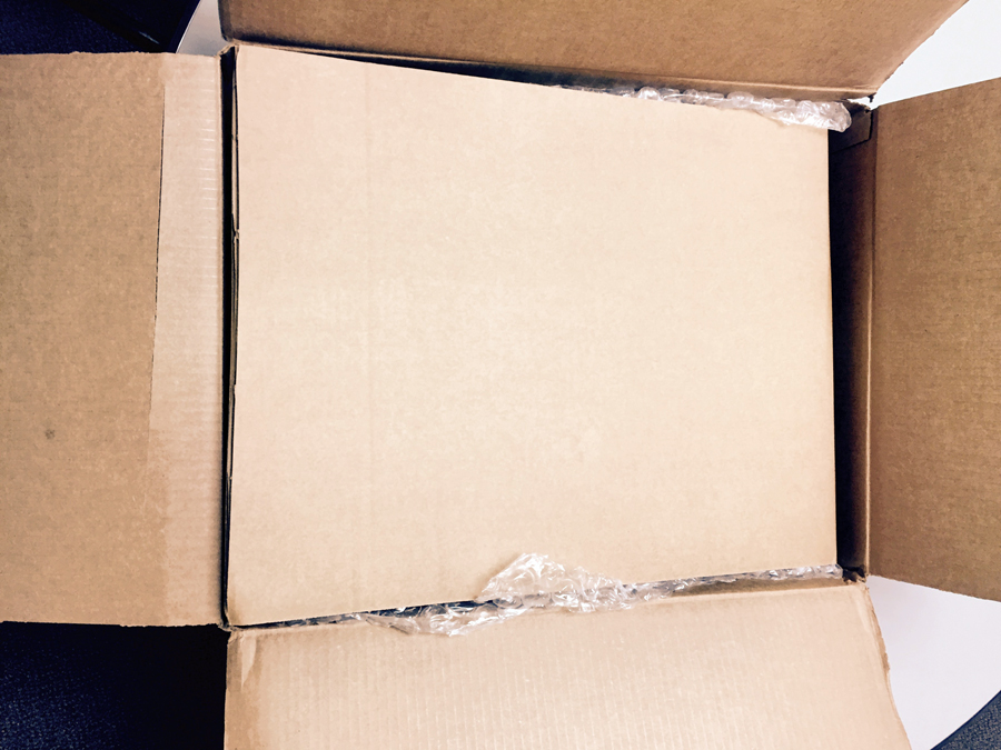
 Bubble wrapping around the main article. Not quite the same level of padding as the Flickr Wall Art, but still acceptable.
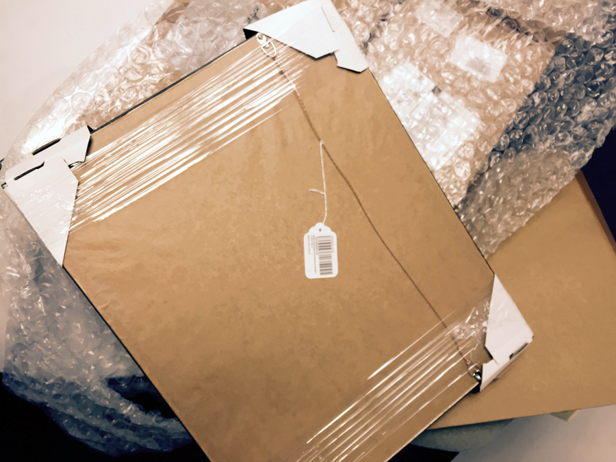 As with most art pieces, the corners are wrapped in pretty heavy-duty cardboard to prevent dents. Great wire for hanging on the back of this piece, by the way.
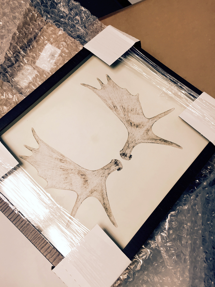 Of course, here’s a glimpse at the actual product. It’s now hanging over my desk at work. It arrived safe and sound, so no complaints from me about the quality of packaging.
If you haven’t already, you should sign up for MyHabit. (This is not a sponsored post, I’m just a big fan.)


