 Click here for all posts in the Brand Experience Project.
I was recently shopping on Colourpop’s website, and was specifically looking at glitter gel, like you do. I got to this product called Trippin on Skies, and had an unfortunate experience with product photos. Let’s get into it.
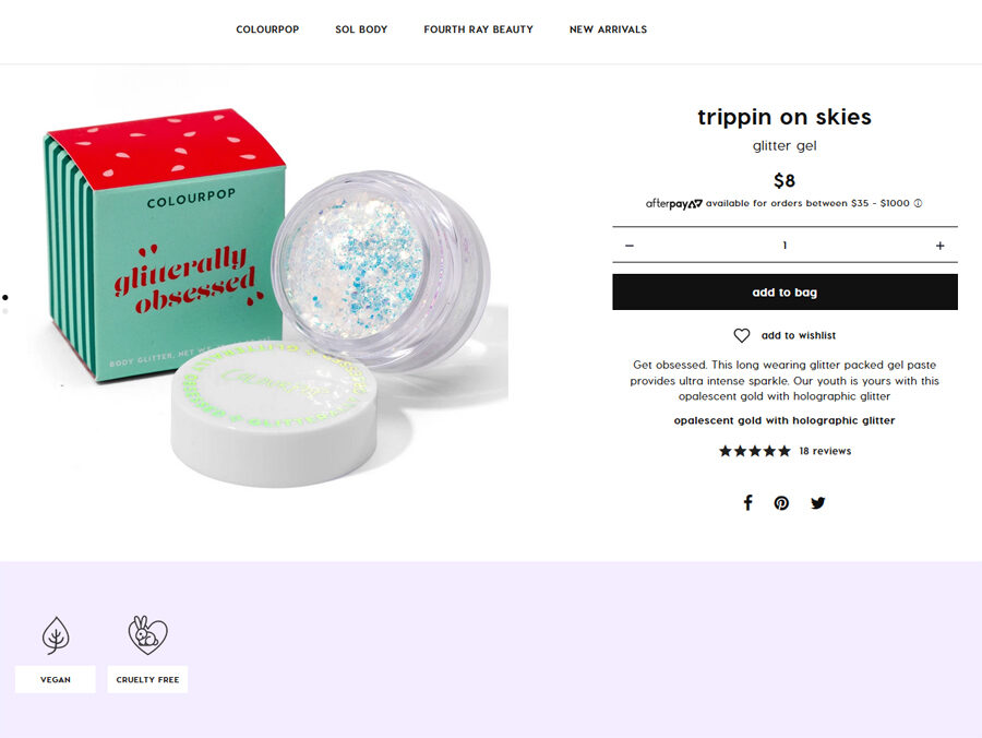
 Here’s my first view of this product page. I’m purposely leaving the bit of box at the bottom of this screenshot. The colors of this product make it a bit difficult to translate, and I found myself immediately wishing to see swatches of this product on actual humans.
 I scrolled down a bit and I get to this second image of the product, this time with the box. This is great and I think more companies should show the packaging of items that they sell, but I’m immediately disappointed that there isn’t a swatch image. Many beauty brands have realized that product swatches on a variety of skin tones is the way to go, and with this product, I really wanted to see what it would look like swatched on skin.
I am now to the bottom of the photo area of the product listing, and so I think there are no more photos to see.
Unrelated to the main topic here, but what I would REALLY like to see with products like a glitter gel that probably builds as you apply more are images with one coat, 2 coats, and 3 coats of the product on each skin tone.
 Luckily, I scroll down a bit more and see a slider of what may be customer images? Colourpop is using Yotpo to collect reviews and it appears that they are also collecting customer images. Clicking on these images shows me that the images above show the use of the Glitterally Obsessed glitter gels, and the center image shows the actual product that I was reviewing.
This is a huge miss by Colourpop:
- There should be some indication in the top images about more images, perhaps “scroll down to see this product in action!” or something similar?
- Better yet, find a way to incorporate images of this product from the feed into the actual product image area on the page. Tag the image with the creator’s name or handle. Ask them for permission to use the image in this way – perhaps feature on social channels or in a promotional email as well.
- Utilize the standardized layout of showing small versions of the available product images and letting the user use the thumbnails to work their way through the options. This would help to keep everything in a single screen – these screenshots are from a 24-inch monitor and so the way this content is spread out seems a bit unnecessary.
Colourpop has good products, and their business seems quite successful, but there are improvements to be made on these product pages.