 Click here for all posts in the Brand Experience Project.
I’m back with a packaging review! It’s been a while, but since I had never ordered from Colourpop before, it seemed like a good time to get back into these posts.
I ordered a palette when they had a sale, and it arrived within a few days. Let’s take a look.
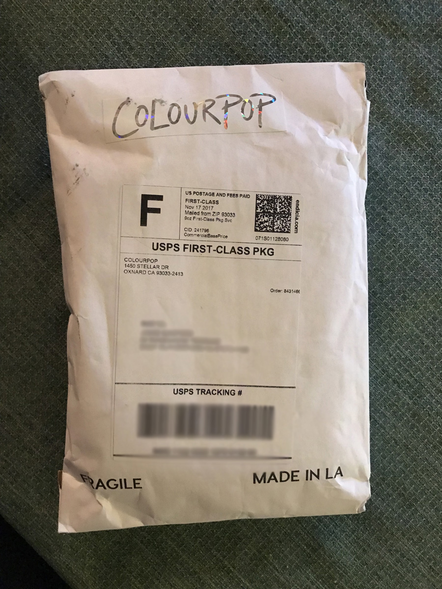 Customized with the sticker, but it doesn’t appear to be a custom envelope.
 Here’s a look at the back, and also at the bubble-wrapped package contents.
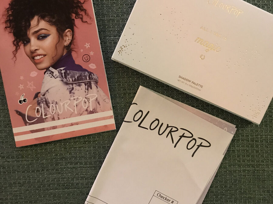
 Out of the bubble wrap, we have a little Colourpop catalog/brochure, the packing list, and the palette in its outer box.
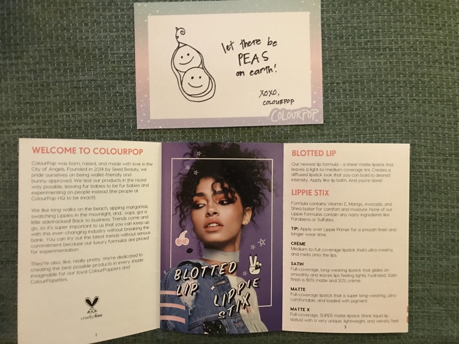 Here’s the inside of the brochure and a shot of the very cute note that was also included.
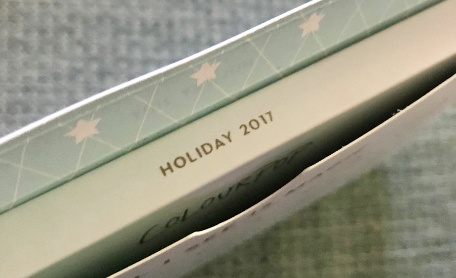 Spoiler alert – this is my favorite thing in this blog post. They label the palette with release dating! Every company should do this!
 The front of the All I See is Magic palette. Unfortunately, you can see that some shadow has escaped the palette and smudged on the outer cover of the palette.
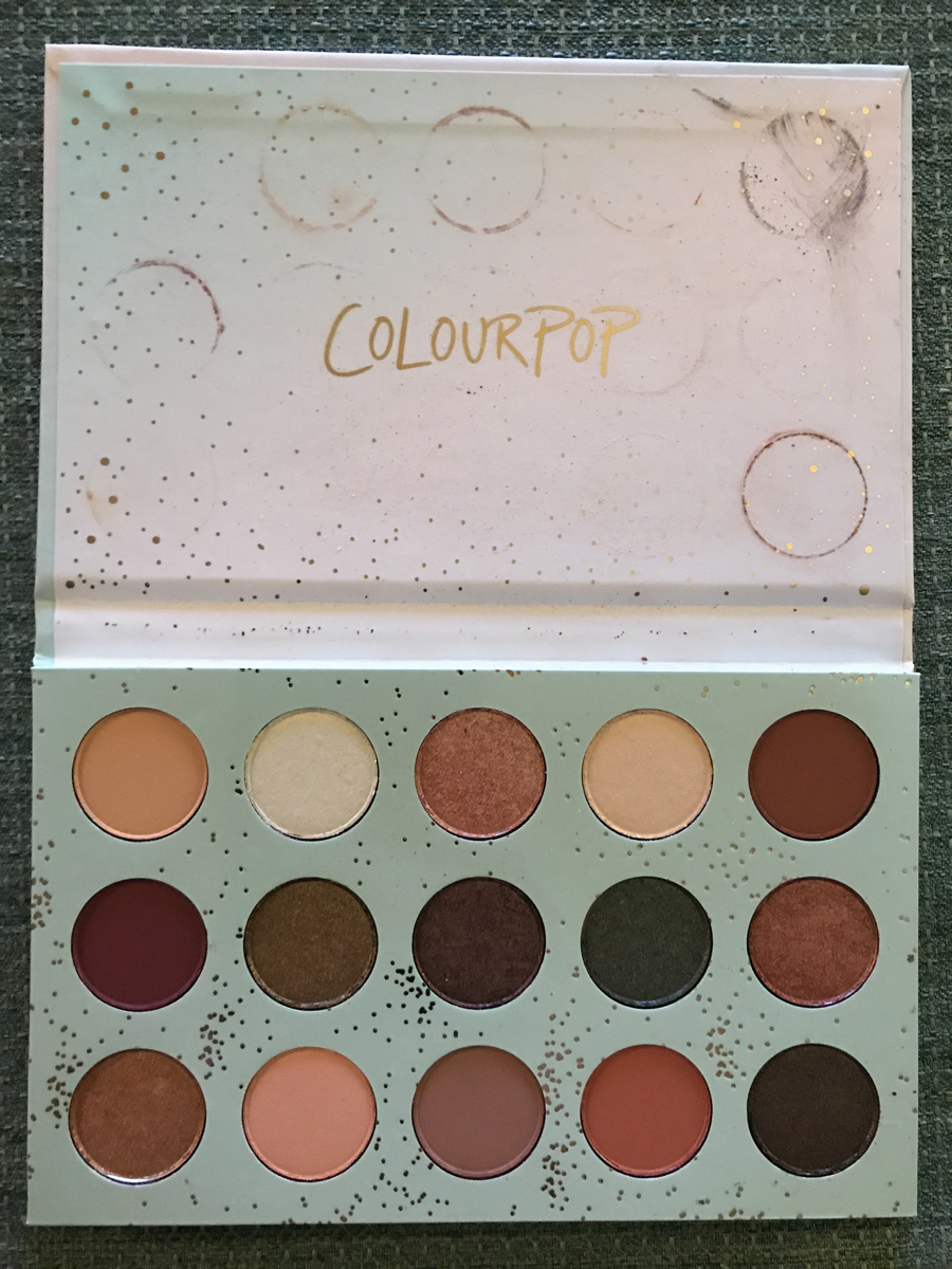 Sadly, this is a bit worse on the inside of the palette. There are issues on some of the individual shadows as well. I don’t know if this is because the palette wasn’t padded enough in shipping, or if the formula of the eyeshadows is such that they are fragile and that this is to be expected, no matter the padding for shipment.
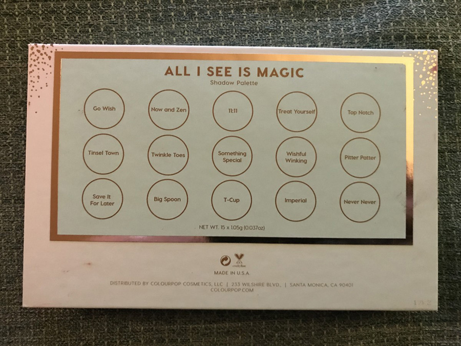 This is the back of the palette. This is the thing that bothers me the most. I can accept that there is a cost savings in not printing eyeshadow names on the inside of the palette. These names are on the back of the palette, but the issue is that it is confusing when you have to flip it over to get the names, because if the shade name is behind where it actually lives in the palette is probably not the name?(The color descriptions on the website do clear this up.)
This could be improved in a few ways:
- If possible, make it work so that the color names can be printed on the inside of the palette
- Use photos of the actual shades on the sticker on the back to ID colors, to avoid the confusion of the layout
- Put this sticker on the inside of the palette! These palettes don’t often have mirrors, so the sticker could just be placed there for ease in seeing the shadow names
 The back of the palette box has the same information as on the sticker on the back of the actual palette. This all could be a little bit better. Again, I know that Colourpop is known for being budget-friendly for great quality, but I would still prefer that they identify issues like this and work it out so that the experience of their brand is just that much better.
I think Colourpop is a really interesting brand, and they appear to be growing like crazy, so I’m hopeful that they can address issues like these while still being able to maintain the tenets of their brand that has brought them to their current place in the market.

