 Click here for all posts in the Brand Experience Project.
Click here for part 2 of the Bluemercury brand experience.
I placed my first order with Bluemercury a while back. My apologies for having no idea when it was, I cannot find a confirmation email for my initial purchase. It’s not often that I would go to such a niche site to buy things, because I can get so many of my products from either Amazon, or use Ulta or Sephora. The reason I went back to Bluemercury was because of a blue box.
Check this image from the Hyperbalist to see the Bluemercury blue box that I am talking about.
The blue box inside the package I received was so gorgeous and lovely that I still have the box. I store my light scarves and handkerchiefs in it, and I placed the order with Bluemercury because I expected another blue box. Let’s see how this all worked out.
Shopping Experience
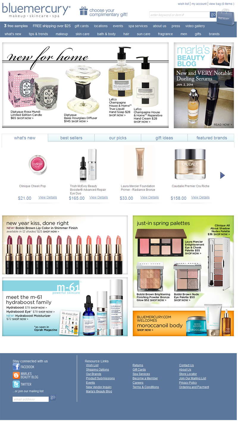 The homepage is well-designed, for the most part. I believe that there could be a lot of consolidation in the menu options. I really love the little shopping bag that takes you to the cart, I think it’s darling. There are also a lot of spaces on the homepage for different items and such to be promoted. It’s a good use of the space, although I wonder how many shoppers are going down so far on the homepage before they’ve used the search feature or the top navigation to move on to their intended item.
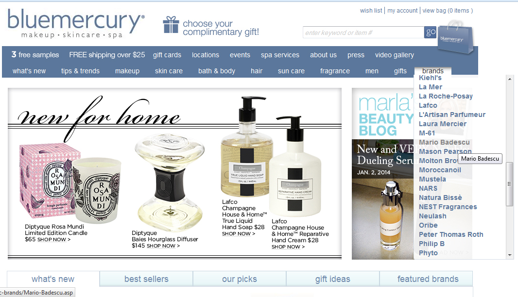 I used the Brands dropdown menu to go straight to Mario Badescu, the brand I came to find. I really like this feature and wonder if more sites should embrace this sort of menu in the site navigation.
 Here is where the site starts to get a little wonky for me. I’m taken immediately to a Mario Badescu brand page, which is great. However, the tab says “view all” and I’m not viewing all. The tab should be re-named “all products” unless the “view all” is the default option.
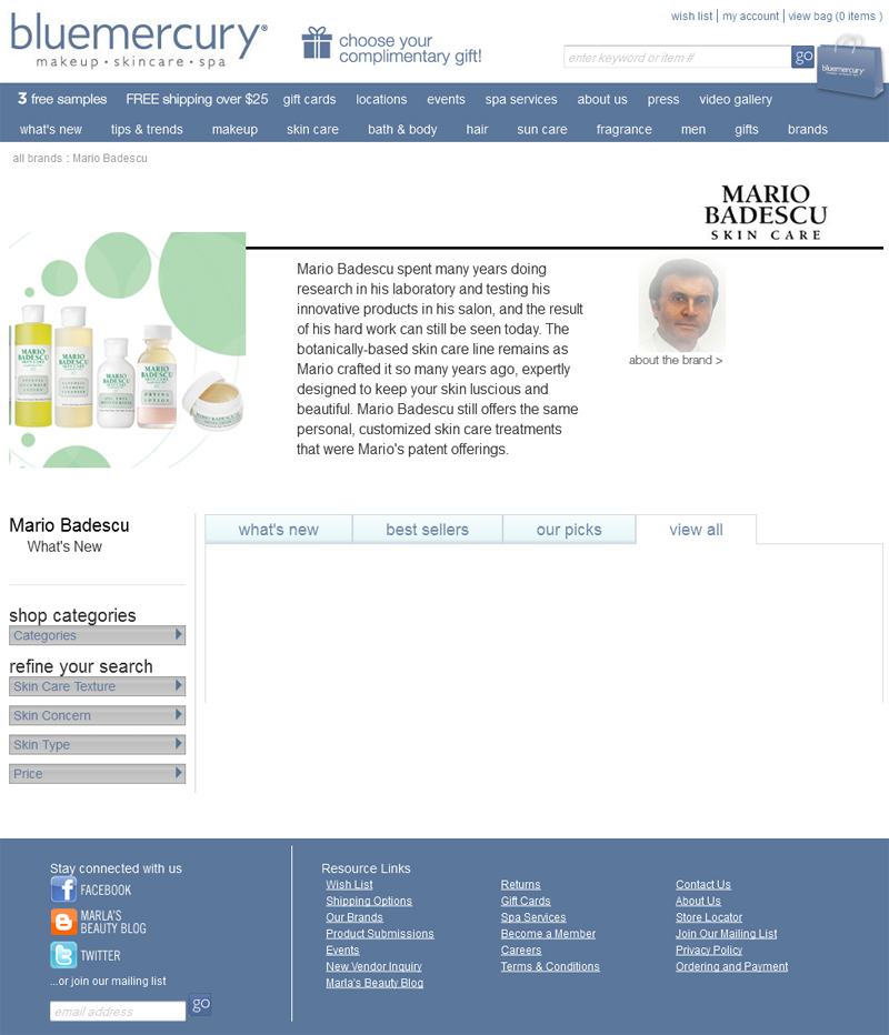 After clicking “view all,” I was treated to a 5-6 second wait with a blank screen (seen above) before the items appeared. An indication that the items are loading would be a good addition here.
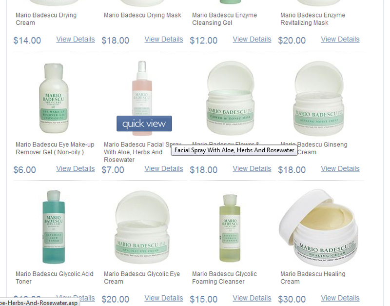 I’m fine with the presentation of items here. The name of the item, the image, and the price are super clear, and you can either access a pop-up quick view, or click “view details” for the product page.
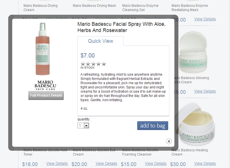 Here’s the quick view. I see no issues with this, other than a missed opportunity to ask for a product review. In addition, the stars with “in stock” right underneath without space could suggest that these 2 things are somehow related.
 On the full product page, my issue with a missing call out to write a review is resolved, as is the “in stock” mention.
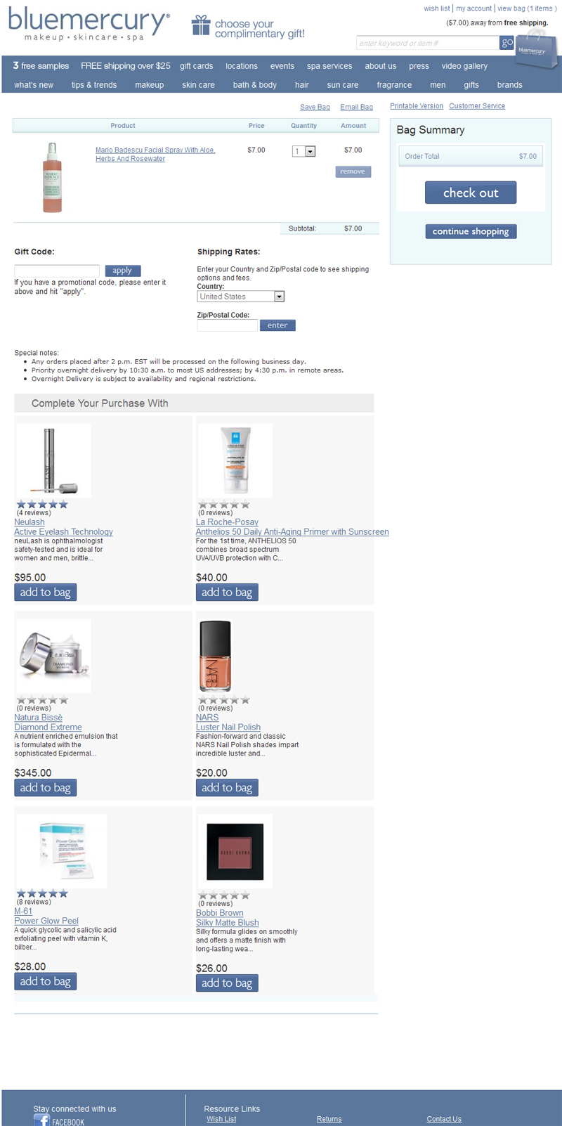 Instead of a pop-up telling me I added to my cart, I am actually taken to the cart. I have no major issues with this page, but I do think the “continue shopping” button could be moved to above the list of products in my cart.
 I then noticed that there’s a message telling me I’m $7 away from free shipping. I find this odd because it very clearly says in the navigation that I don’t get free shipping until I hit $25.
 After adding a second bottle of facial spray, I do in fact confirm that the message in the header is backwards, and telling me the wrong number. I am not $14 away from free shipping. I am actually now $11 away from free shipping. This obviously needs to be fixed.
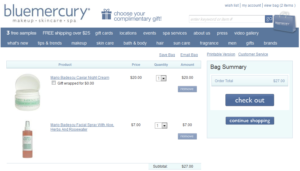 After all of that drama, I would appreciate a message at the top telling me that I have qualified for free shipping.
Checkout
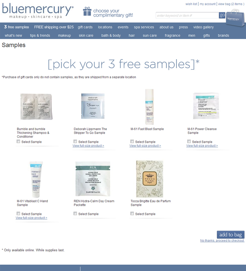 Samples are always a good idea. I have definitely purchased products after having samples. The samples are coming from the manufacturers, it costs next to nothing to add the weight to the box, it’s a win-win-win.
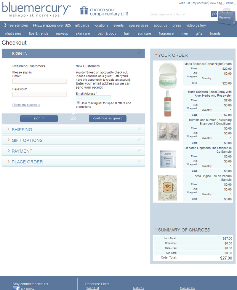 This page is pretty straightforward, but the line breaks on the right (see “gift wrapped” and “quantity”) are bugging me.
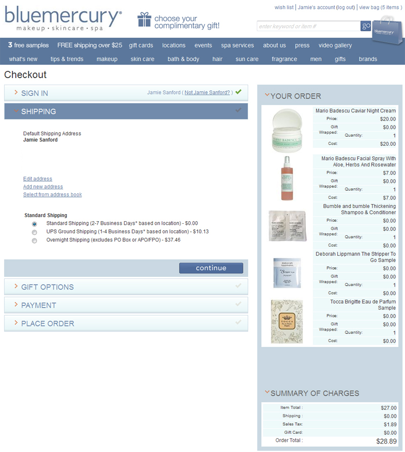 My pet peeve for no link to a pop-up with shipping information is poking at me here. I appreciate the descriptions on the shipping data, but the ground information is not helpful. Especially because the actual shipping page has a convenient ground shipping map with information on how long a package will take to get to you based on your state. Put a link to a new window with this shipping page!
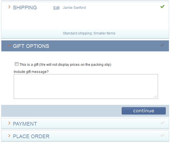 Back to the blue box issue. I am expecting it because I’ve received it in the past. But I see no mention of it here, and no option for gift wrap.
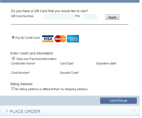 Other than a lack of variety in the payment methods, I had no problems in this area.
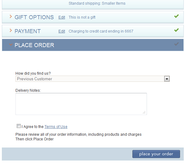 Nitpicky, yes, but please have someone review sentence structure and punctuation. Don’t tell me to “then click Place Order” when the button says “place your order.” I just want there to be consistency, and also, if the idea is that you are trying to be high-end, things like this do matter.
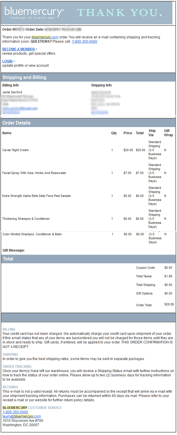 I like the confirmation email. It’s super clear, it gives you lots of opportunities to contact Bluemercury if you have questions or concerns. Billing, shipping, returns, it’s all there. Good job.
Packaging
I was really excited to receive my Bluemercury box. I didn’t buy products that were lifechangers, these are Mario Badescu products that I was refilling, but I really wanted that blue box.
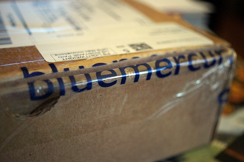 The box was not customized, but the tape was, so that was fun.
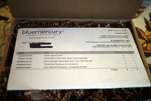 From previous brand experience project posts, you know that I am a stickler for good treatment of the packing list! This one was nicely folded in half, right on top of the box. Props to the box for having a fold back lid as well.
 They are messy but I do enjoy the crinkly package filler. It’s also much better for the earth than some packing peanuts.
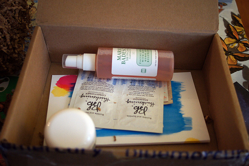 Unfortunately, disappointment was in the box along with my products. The magical blue box is missing from my order. I have no idea if they have phased the blue box out of online orders, or perhaps there is a purchase minimum for inclusion of the blue box? I would love for someone from Bluemercury to let me know what happened to the best online order packaging I had ever received.
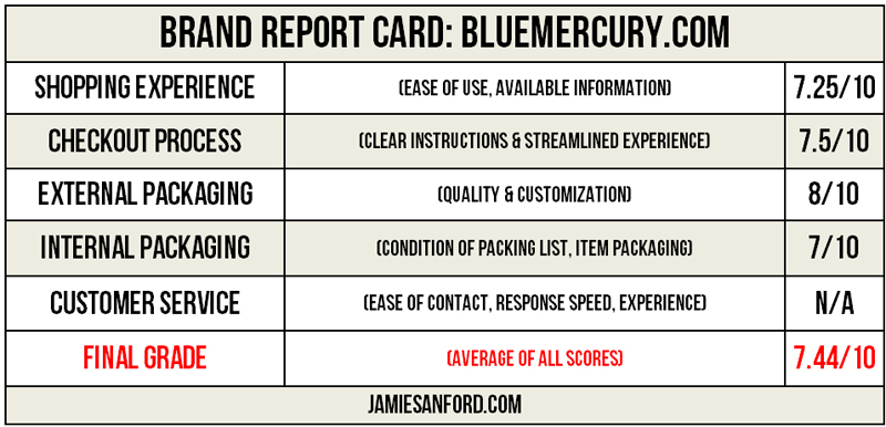 I haven’t scored in a while and it was more difficult than I remembered. The overall experience was fine, right, because I placed an order for certain things, and they ended up arriving to my home without any issues or problems. There were just a number of issues I had during the process that frustrated me, and definitely need to be adjusted, particularly the free shipping countdown situation.
Have you shopped Bluemercury.com, or gone back to a site to shop again because of a past experience? Did it live up to your expectations? Leave a comment!
Click here for part 2 of the Bluemercury brand experience.

