
Click here for all posts in the Brand Experience Project.
I am a Vanity Fair subscriber. I’ve only become one in the past few years, but in addition to enjoying the magazine, I think their online content is great.
Cut to me being very confused at a recent Vanity Fair email. This is a regular email I receive to alert me to new content.
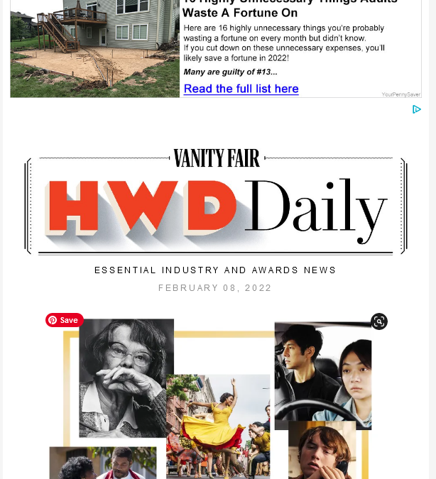
Let’s take a look.
What is happening with that top ad? I have a few questions.
- Is the VF email designer aware of how large that ad would be?
- Are they blindly using an ad generator without vetting the ads that are populating in that location?
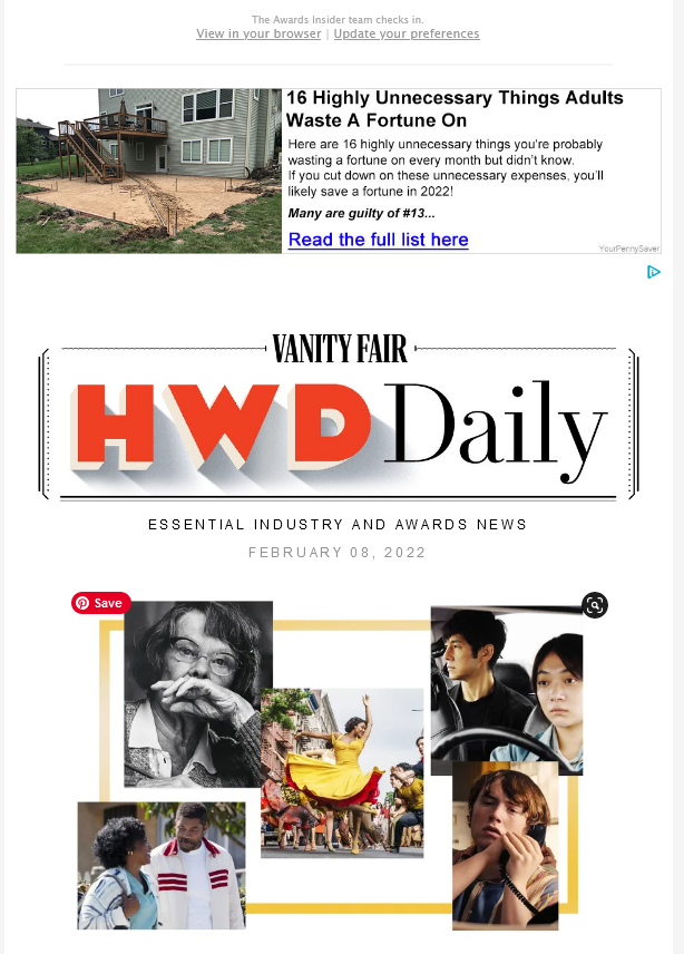
Here’s the second half of the message.

So, it’s the same ad at the bottom, just bigger. I do not like this.
I think of Vanity Fair as a well-designed, high-end publication. These ads do NOT match my perception of what should be showing up in a Vanity Fair email. I know that revenue generation is paramount, particularly when your business is content, but this is just not the way.
Suggestions:
- Offer ad packages that would include funding for ads to be pre-approved by a VF employee or potentially designed by VF (additional cost)
- Hire an advertising agency to manage the ad spots (I realize that there is likely a significant cost here)
- Use the email ad spots to advertise other content on VF, sending them to the website, where the ads may be less obtrusive to the content (potential reduction in email revenue but hopefully would increase site traffic and improve earnings there)
Not much else to say. The ad content isn’t offensive, it just doesn’t vibe with the content of the email and is jarring to the reader.