 Click here for all posts in the Brand Experience Project.
Universal Standard is a brand that I do like, but don’t LOVE. I appreciate their mission to dress all bodies in size 0-40, because that isn’t happening enough, but I do wish that there were more items available and that they had a bit more variety in style.
A further exploration of that is for another time. For now, I wanted to briefly explore the size dropdown menu on Universal Standard product pages.
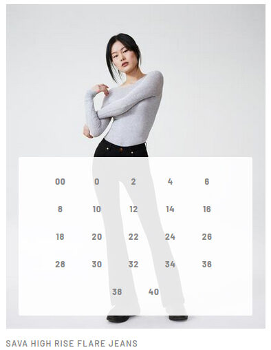
 Here is a typical product page. This time for these cute Sava jeans.
 On the right are the typical buttons, for selecting your size and then to add the item to your cart.
 Here’s where I get confused. How is this the choice that they have made regarding the size dropdown? With so many sizes available, why has no effort been made to abbreviate the effort to find a larger size? There is clearly plenty of space to create columns in order to avoid this.
I was especially surprised to see this clunky presentation of size choices when I saw this “quick shop” feature on a page with a number of products:
 This DEFINITELY needs to be replicated on the individual product page. It’s much cleaner and more concise than the incredibly long, space-wasting dropdown that is currently on the website.
Let me know how you would improve this dropdown on Twitter.