 Click here for all posts in the Brand Experience Project. This post contains affiliate links, which means I will receive a small commission if you make a purchase after clicking on one of my links.
I’m back at it with another Sephora.com post, unsurprisingly. Sephora is second only to Amazon when it comes to websites that take all of my money.
I have talked about the sale page on Sephora.com before, outlining the issue of “view all but not really.” They still have this issue.
This issue is with the sale page as well. Let’s get into it.
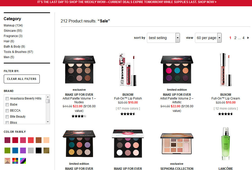
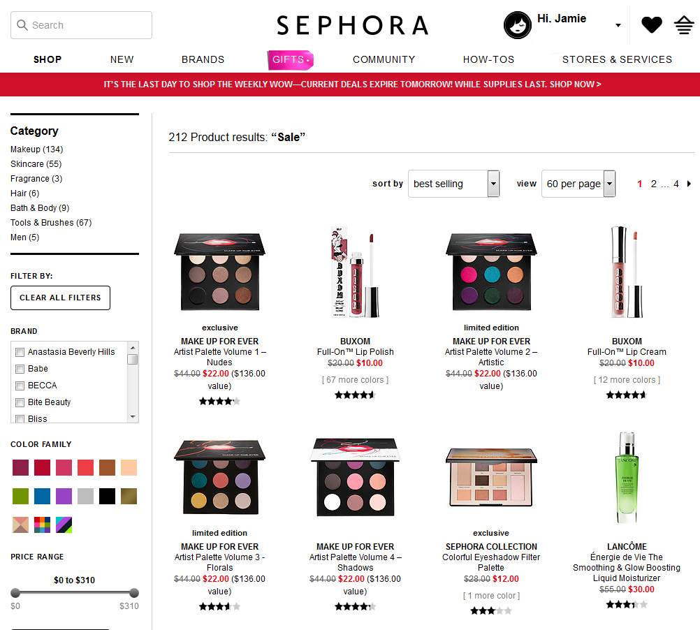 OK, here’s the sale section. What is that item I see? A Make Up For Ever Nude palette? YES PLEASE.
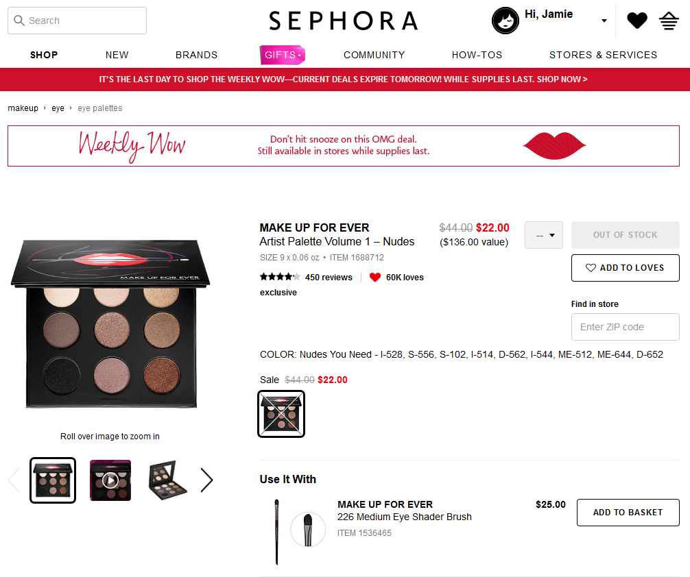 Out of stock. Grrrr.
As someone who runs an e-commerce site, I know that you don’t necessarily deactivate an item as soon as it runs out of stock. But on a product listing page, it’s really disingenuous to not let someone know that the product is out of stock. Is it a ploy for more page views? I can’t understand why that would be a big concern for Sephora, their business appears to be booming.
It would be simple enough for Sephora to activate “add to cart” buttons on the product listing page, and those buttons would also show items as out of stock when they are out of stock.
Perhaps things that aren’t a game changer but COULD be fixed are not on Sephora’s priority list. I would love to see tweaks made to make their site easier and faster to use.

