 Click here for all posts in the Brand Experience Project.
A short post today, in which I’m SUPER excited that a website got it right for me with a shipping email!
I haven’t shopped at Hot Topic in a long time, but I found out that they have Trixie Mattel t-shirts, so it was all over.
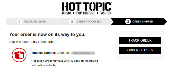
Here’s the important parts of the shipping email:
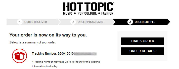 Simple and effective!
- I really like the consistency of the banner at the top of the emails, showing order progress.
- Right at the top, front and center, is a red icon alerting me to the link to my shipping information! The link takes you to the USPS website.
- The disclaimer about “we’re sending you the number now, but USPS might not have it yet so don’t panic for at least 48 hours” is right under the link, where it should be.
Hot Topic isn’t using a third-party software to present shipping information, but I don’t think what they are doing now is lacking in any way. The services offered by Narvar are fancy and lovely, but the cost is significant to the retailer, when this simple link to the shipping company is completely fine.
Congratulations to Hot Topic for creating a shipping email that isn’t confusing or vague, that gives me all of the information I need, at the top of the email. While I do understand that some e-commerce companies will make the large investment for fancy options for mobile alerts, etc, not all organizations are going to be able to incur that expense. Those e-commerce companies should definitely look to Hot Topic as a template for their own shipping information emails.

