 Click here for all posts in the Brand Experience Project.
I recently made a purchase utilizing Flickr’s Wall Art capability, and was impressed at the ease of the process. Let’s take a look.
 I took this photo with my phone after one of the snowstorms we had in the past few weeks, and immediately loved that it looks mostly black and white. I initially posted on Instagram, then re-posted the full version on Flickr.
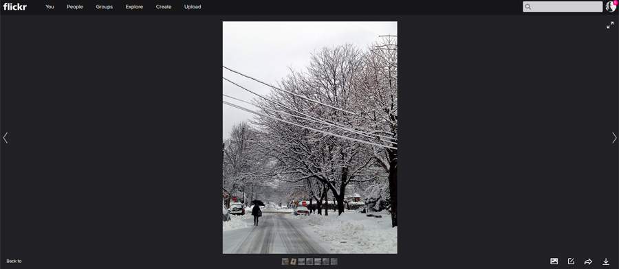 The image in Flickr. I can immediately say that while I completely love and appreciate the minimal design here, I do wish the “you can make this photo into a physical item” was a bit more obvious.
 You can see that it tells you what the leftmost icon is when you scroll over it though.
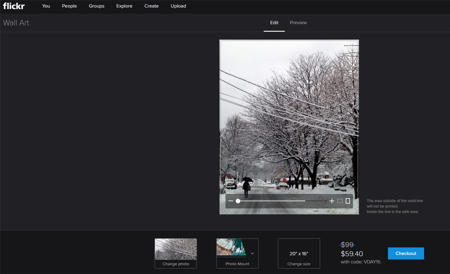 The next screen shows you the crop line for your image, and gives you options to change the photo, the style of mount, and the size. It also gives a preview of the price with a discount code, which I really like. I would love to know the data on sales when people are shown the discount vs being told that they will receive X% off with a code.
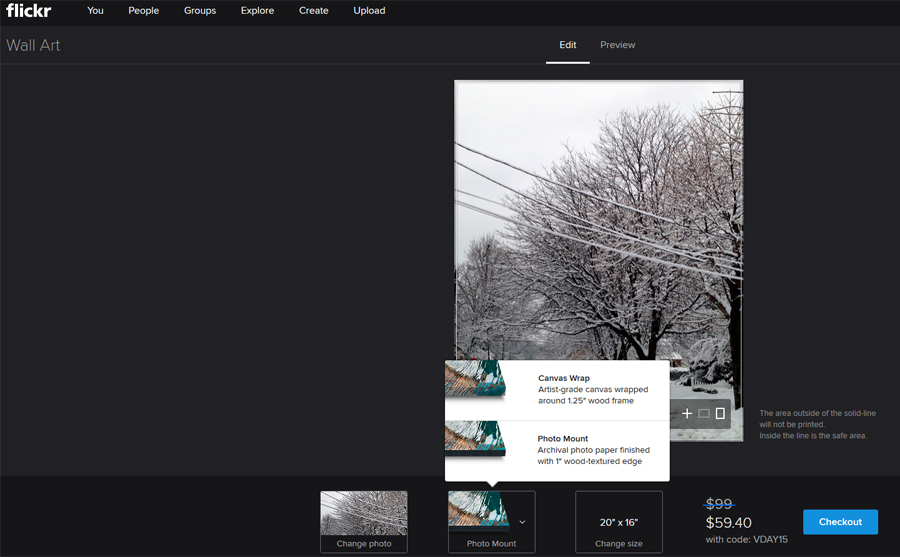 The mount options are a canvas wrap or a photo mount on a standout. I recently ordered a standout from Mpix that is lovely, so I’m interested to see how this one turns out.
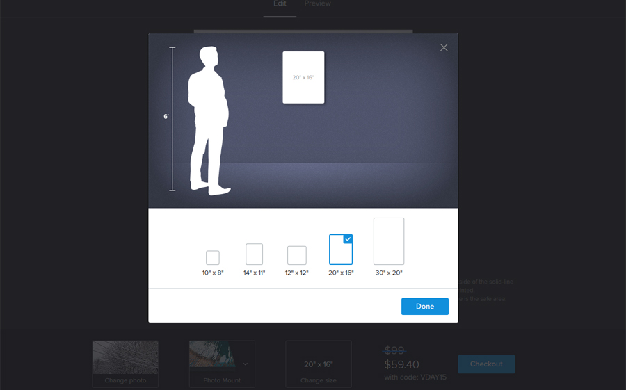 I really love the presentation of the item’s size. How lovely to use the scale man next to the wall. This is elegant and really helpful.
 The checkout process is very easy throughout. There are websites that make entering simple address and credit card information seem difficult and bulky, and this is the opposite of that.
I see the two shipping options, and click the “more info” to see what is going on there.
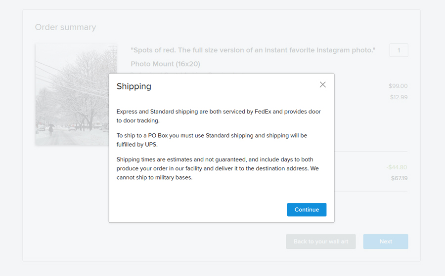 They are after my own heart with this – anyone familiar with my Brand Experience posts knows that I want all information during checkout presented as pop-ups so that I don’t have to leave the page.
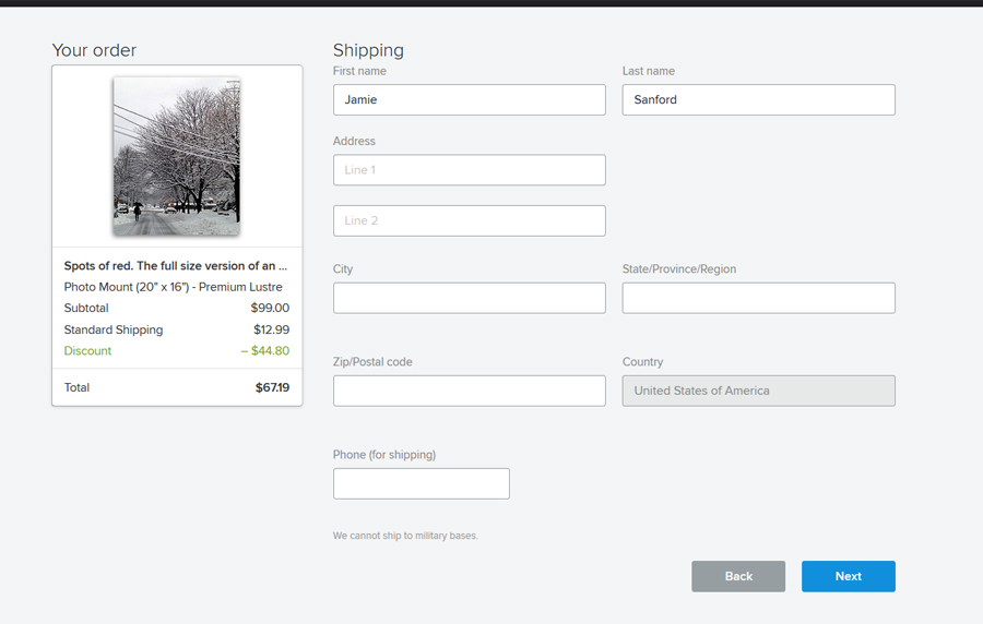 Everything here is fine. I would recommend moving the “we cannot ship to military bases” to above the address lines, so that someone’s time isn’t wasted.
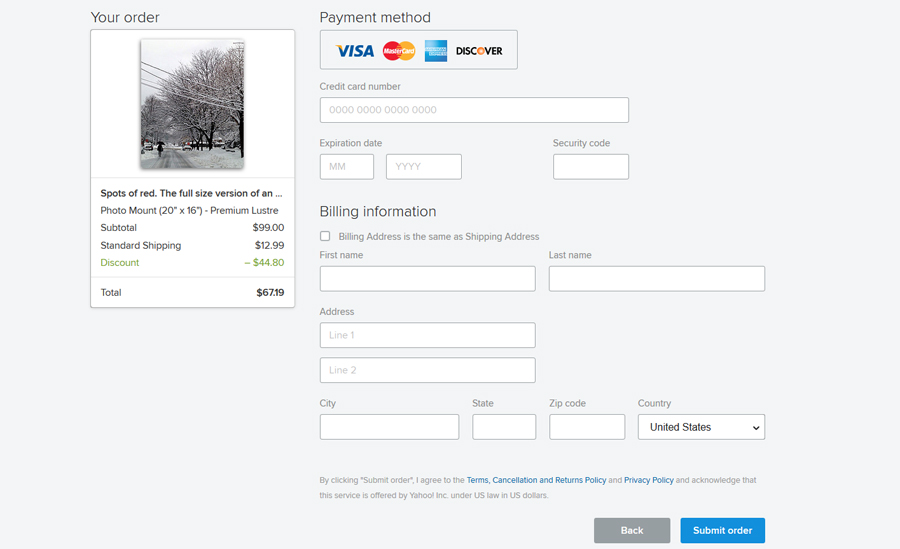 Unfortunately, the two links at the bottom do not open in pop-ups. They do open in new tabs though, which is still OK. I’m assuming that this content is such that Flickr only wants to link to one central location where this information is kept, for ease in updating and making sure that all references to these policies are to the most updated versions.
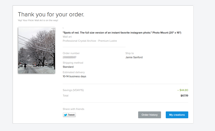 I am wondering why the share option is limited to Twitter. This sort of personalized art seems better suited for sharing on Facebook or Pinterest.
I really like the estimated delivery window. Vague at 4 days, but still acknowledging a timeline.
My major issue with this screen is that there isn’t a clear option for a “printable” version, or better yet, the chance to save the confirmation as a PDF. This is something we will continue to see more and more, and is such a better option than asking people to print receipts all of the time.
Side note – download and install PrimoPDF if you are looking for software that will allow you to create PDFs. This is great for all of your online purchases and also for bill payment confirmations, etc.
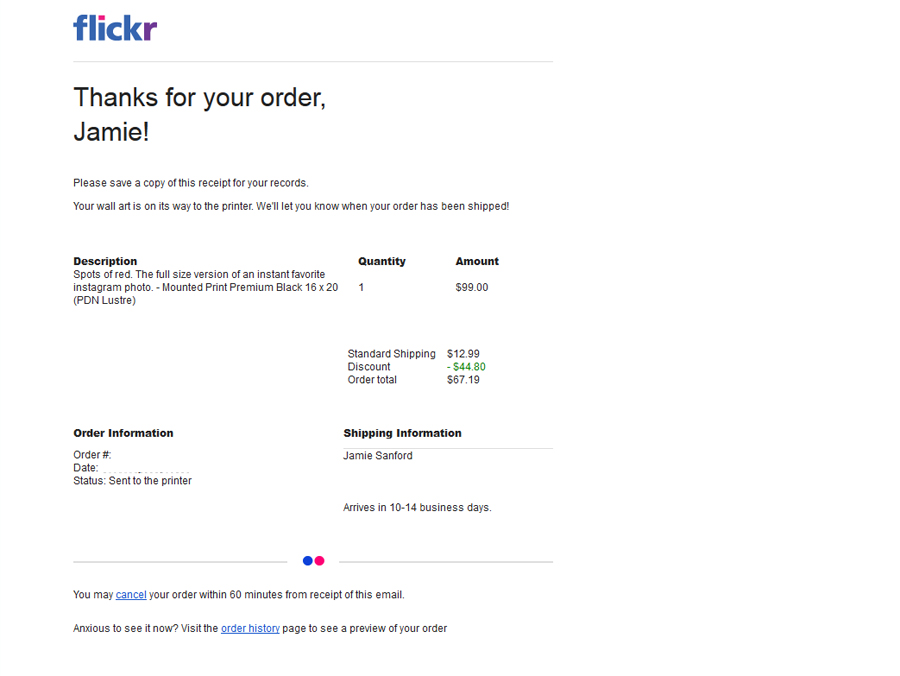 The email confirmation. I’m wondering what the reasoning is behind not telling someone they can cancel their order until the email – it certainly didn’t say that on the confirmation page for the order.
I was super pleasantly surprised by the ease of this process, and the gorgeous simplicity of the steps. Sure, it is similar to every other checkout process, but this felt really light and lovely. I will check back in with a product review when I receive my photo mount in a few weeks.


