 Click here for all posts in the Brand Experience Project.

My parents have a newish puppy, and when I visited recently, became acutely aware that the toughest toys ever are necessary for even a 12-pound Boston Terrier. More interest in finding toys that will take longer for him to destroy led me to DogTuff.com.
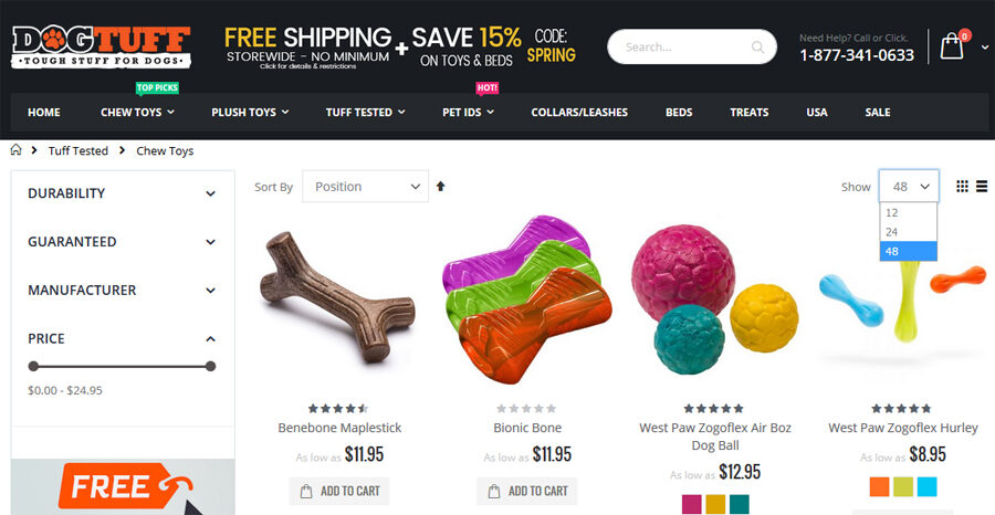
I have some thoughts based on the screenshot above.
- Logo
- I find it a bit hard to read and wish it was bigger. I do understand that with the other choices made in the header that there is not much room to increase logo size.
- Header Offers
- I absolutely understand the reasoning behind putting information about free shipping and a discount in the header so that it appears on each page, but there is a LOT of information here, and it might be too much for someone to stop and read instead of skipping to the shopping part.
- Need Help/Phone Number
- If the phone number is in white font over a black background, why have the messaging above it in grey? It seems like a weird time to suddenly be subtle.
- ‘Top Picks” and “Hot” Flags
- Something else I think is crowding the situation and isn’t necessary. I think that if a customer has made it to a website called DogTuff.com, they probably have an idea of why they are visiting. There is already so much happening in this header, I think the labels could be sacrificed and the customers will still be able to navigate without issue.
- Show (number) Dropdown
- How is there not an option to show all?! If not show all, there should be a review of the average number of items per category to determine the best options for how many items to view per page. I can attest from years of experience in e-commerce to knowing that many people prefer an option to view all results.
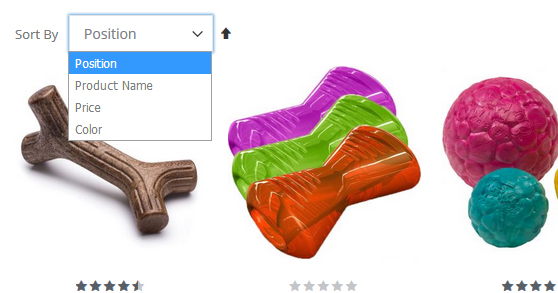
Here’s another screenshot to discuss another dropdown:

- “Sort By” Dropdown
- What does “position” mean here? There is absolutely no indication, and it is the default option on this main page for “chew toys.”
- I am also not sure that Product Name and Color are best used as sorting tools in a dropdown, I would rather see a filter on the left side to choose a color or a product type.
- Price is an obvious choice here, but I would like to see options for “Price Low to High” or “Price High to Low” instead of relying on the small arrow to the right for the customer to control that function.
That’s all I have on this for now. I love this website – toys that take your dog longer than 30 minutes to eviscerate are good! I am, however, generally always interested in creating the most value in terms of customer experience with the least possible amount of clutter on the screen.
Let me know your thoughts on Twitter!


